Bienville House
Logistics of this New Orleans based, working family (homeowners) required them to be home indoors for long periods, which in addition to work and school became disruptive to their wellness. They began to contemplate, like many families, whether a move to the suburbs, exchanging proximity to great citywide amenities for a larger backyard to increase outdoor access was necessary. Rather than moving far away, they decided to build a new house that would reconsider the limitations of indoor home life on a small urban lot.
The organizing principle of the project was to create as much outdoor access from communal areas as possible. Communal areas also needed to remain spacious despite the necessity for density due to lot size and additional project needs.
Built on a 32’x105’ site, the rear unit is 4br/3.5bth and the front is 3br/2.5bth. The layout orients the front unit as its public face, actively engaging travelers with the city, while mirroring the position of the primary unit to connect with the rear yard favoring seclusion.
First floor spaces where communal spaces are arranged have 12’ high ceilings. In the rear unit an exterior deck extends from the inside level over the rear yard connecting to a raised pool. Two sliding glass walls open to create a poly-access opening to the exterior including the pool which is partially covered by the structure above. The front unit façade is glazed from floor to ceiling as well with 15’ wide sliding panels opening to a deck flanking the front sidewalk.
The forms are configured to convey a transparency of internal use. The upper floors contain private spaces wrapped by exterior surfaces forming an echelon of suspended cubic forms legible from multiple viewpoints including the underside. Exterior cladding wraps as a ceiling to materially connect the outside within. The cubic forms are supported by a series of exposed concrete walls with a gap between to visually render each form distinctly. The static forms juxtapose animated interior space as a frame to reinforcing the transparency of the 1st floor interior.
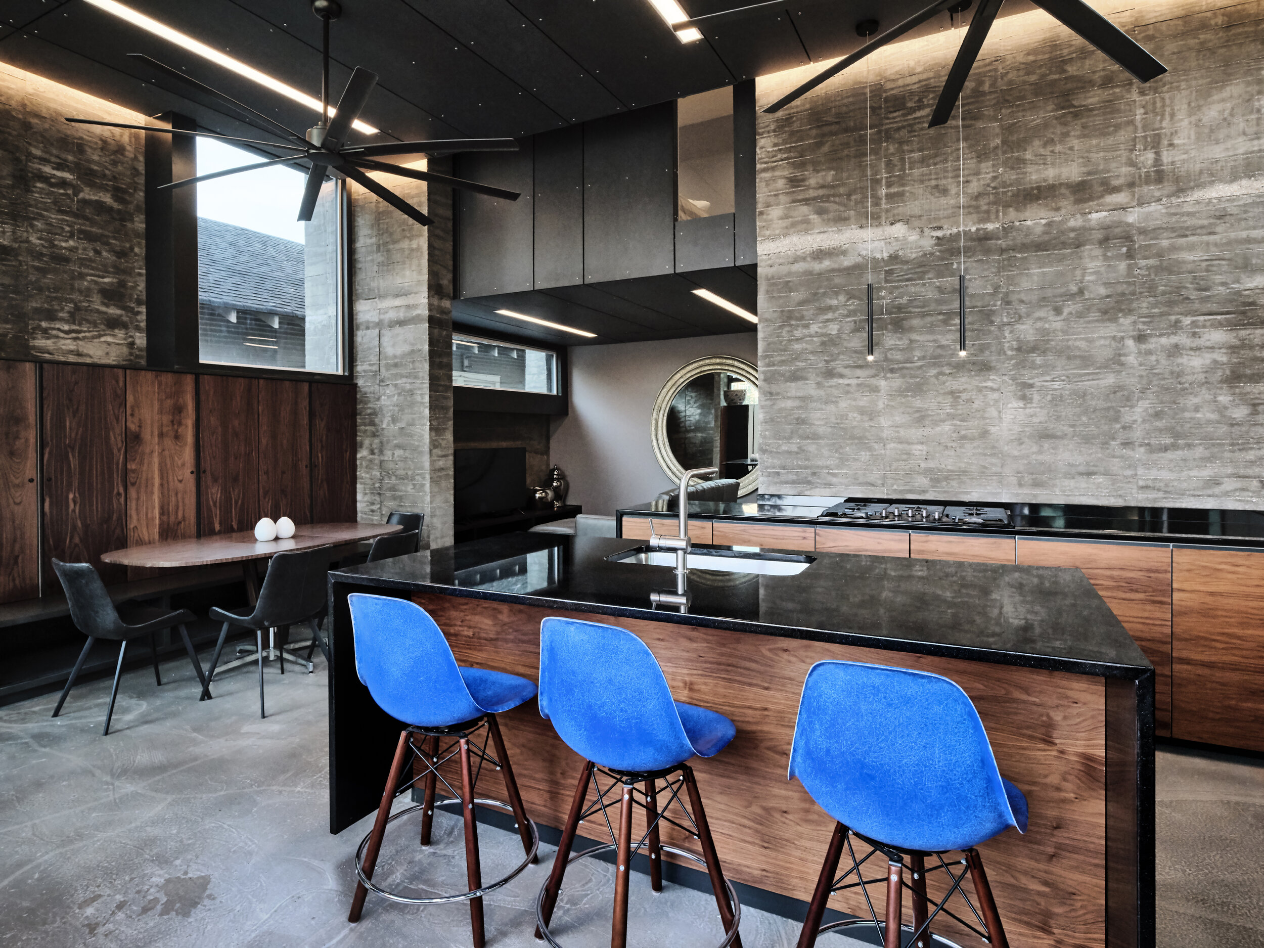
Finishes on the first floor are raw and exposed, serving as a backdrop to render activity and furnishing more vividly. Concrete walls are exposed where possible and kitchen cabinets are clear stained walnut with handles routed into horizontal edges. Finishes on the upper floors, by contrast, are more static and colorful. A series of multi-colored accent walls are inserted to embolden the defined use of each distinct space.


